


This year the students of third year bachelor studies and first year of master’s were assigned with a Czech-American TV project. It presents Czech culture and traditions to the American public through web and TV broadcast. The goal was to design a complete set of graphical features that would cover all the visual needs for this TV channel. Two different classes were conjoined and worked as one team. Firstly, we researched visual communication of televisions all across the world. Then we designed several concepts and discussed them in order to choose the best one and in the end we settled for a concept with cat mascot. The abbreviation for Czech-American TV is CATV, which was one of the reasons, and the second one was the fact that cat is a typical Czech domestic animal. It provides both a solid selection of sounds and a wide range of behavioural patterns typical for cats. It is possible to change this motive in future without a disruption of the visual communication and its coherence. We split into smaller groups that worked parallelly with each other on tasks such as typography, cat illustrations, and scripts for jingles and TV show spots. Over time those groups transformed themselves alongside the development of the project. As an example – later we formed a group focused on web redesign.
The tasks we were assigned included visual style redesign, animated sign, logotype, websites redesign and a set of trailers for online presentation on Twitter and Facebook. As a part of the task we had to create a set of spots promoting CATV, fundraising spots as well as spots to mention sponsors at the beginning and end of the broadcast. Besides, we worked on the Regions project. We created a set of signs for individual regions of the Czech Republic, three short spots and a jingle.
Typography
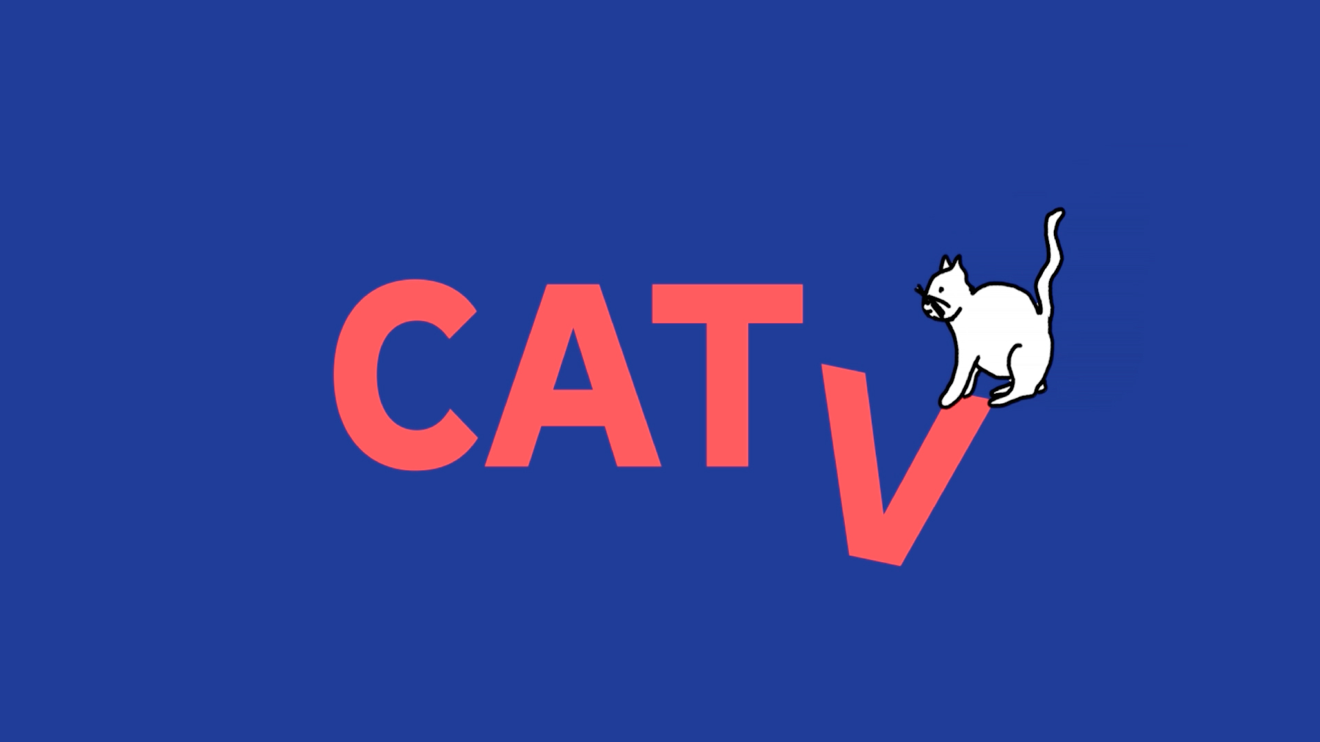
We decided to create a logotype that would be as unintrusive as possible while possessing a character that would allow it to contain a wide range of additional information included in TV production. The goal was to keep a unified framework for both the TV and online broadcast in order to provide uniformed and intelligible impression. To construct the logotype we have chosen the Zeppelin font made by František Štorm. The same font is used in other applications (business cards, notepaper, press cards, TV broadcast and the websites). This font is recognizable by its rounded robust arch, which makes it distinct and memorable on a screen. At the same time it comes across as consistent even when printed and on accompanying materials.
This versatility of our medial production allowed us to create secondary variant to our logotype with abbreviation (CATV). This secondary variant is the whole name: Czech-American TV.
The color scheme is made of the three basic colours – blue and red. The logotype is positioned in the (upper/lower) right corner; it has grey colour with 70% transparency. The reason is to make the sign unobtrusive during the TV broadcast. Several times during the broadcast, the primary logo unfolds into the whole name variant.
The visual style is accompanied by a short video – indent CATV, which combines the mascot with the sign. There are also videos such as the programme, sponsors, a call for donations and final captions. All the videos use distinctive movement – text lowering.
Cat Illustration
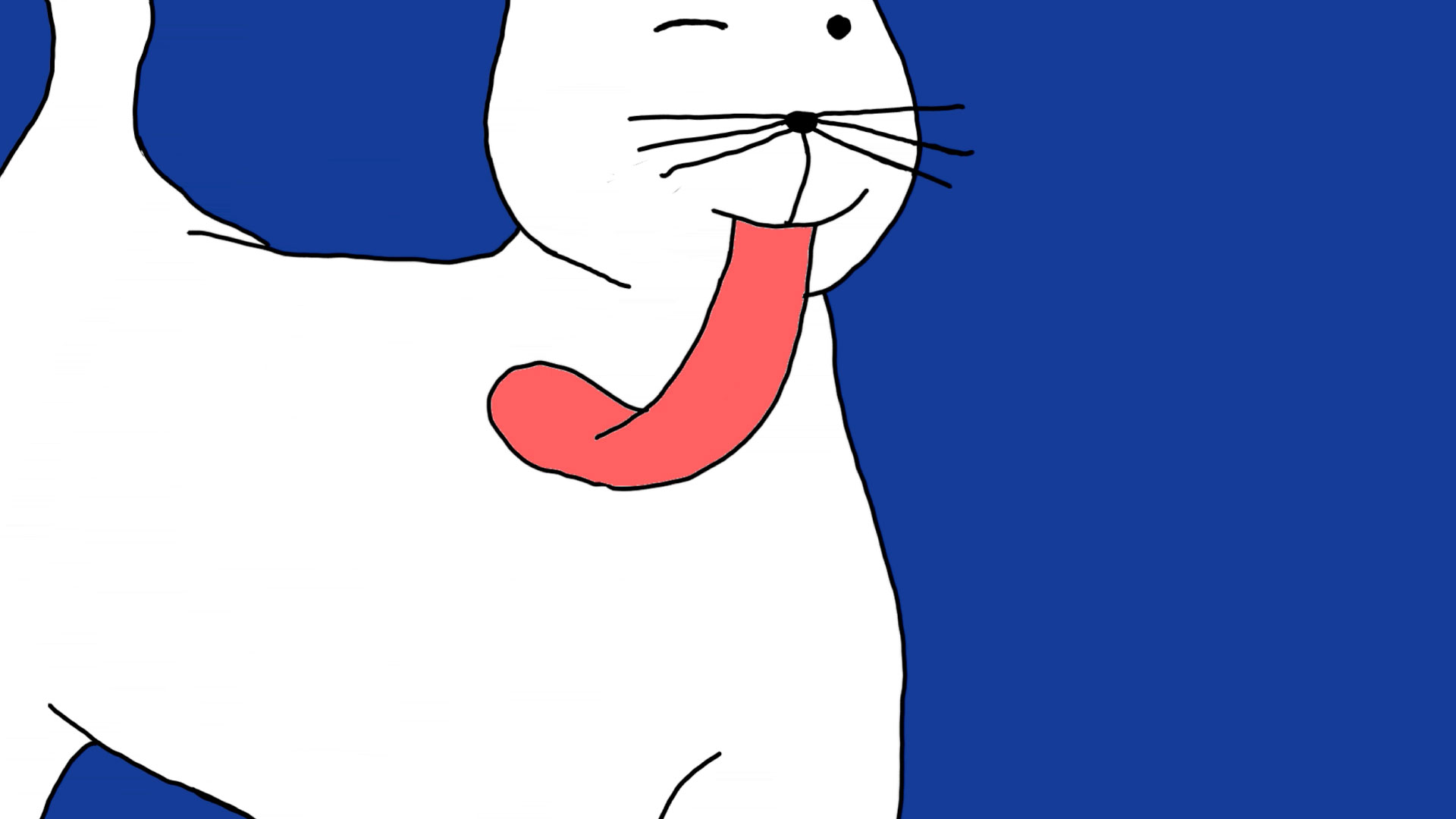
The mascot’s style is inspired by the resemblance of typical Czech cat, which has black lines and white filling in order to be recognizable on backgrounds of different colours. Features the cat meets with are drawn with thinner lines than the cat itself as not to disrupt ist emplacement. The animations contain moves typical for a cat – jumping, licking, nuzzling and so on. The animatons were made in TVPaint – frame after frame with a drawing tablet. The short eight second long spot contains about fifty frames and the twelve second long jingle containt about a hundred or more frames. Nine animations were created in total (indent, social medias, a jingle and three spots for TV show Regions, jingles for TV shows Cooking, Traditions and Lessons).
Scripts
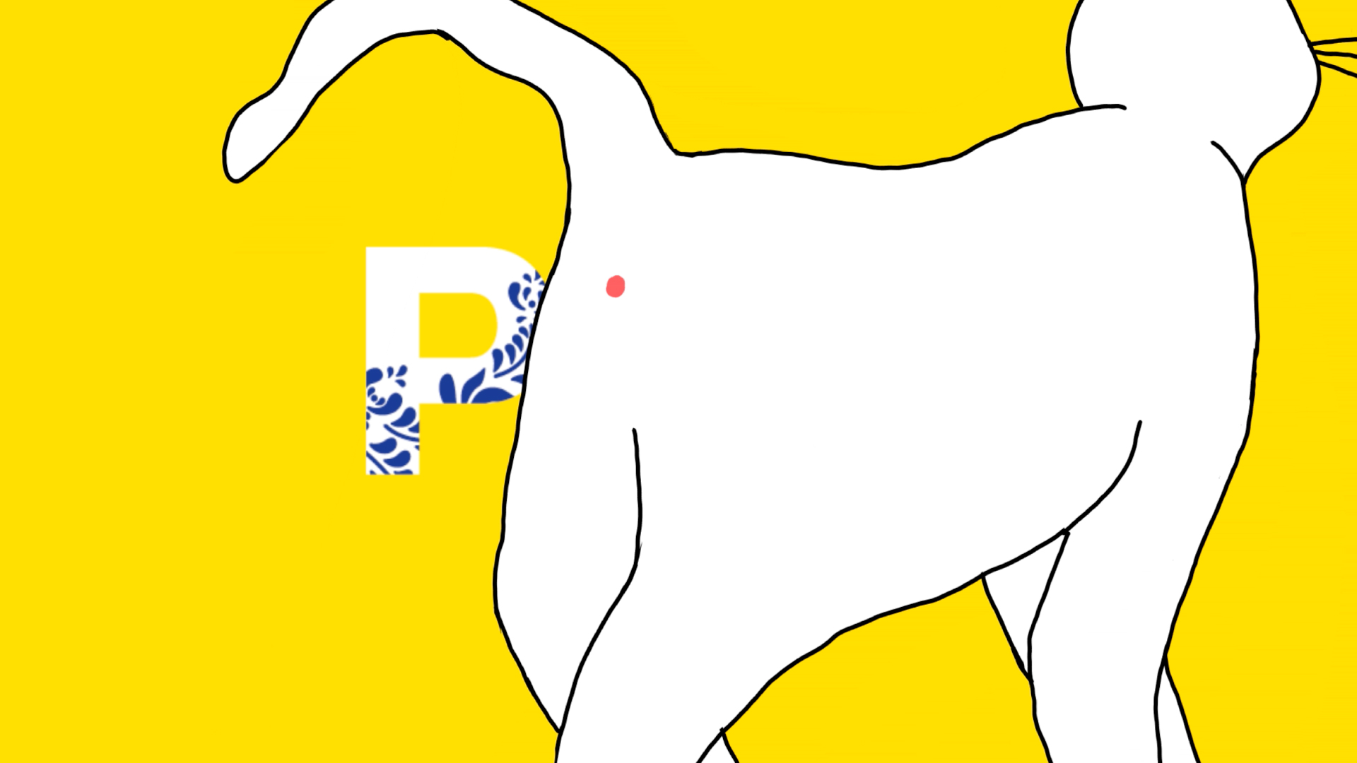
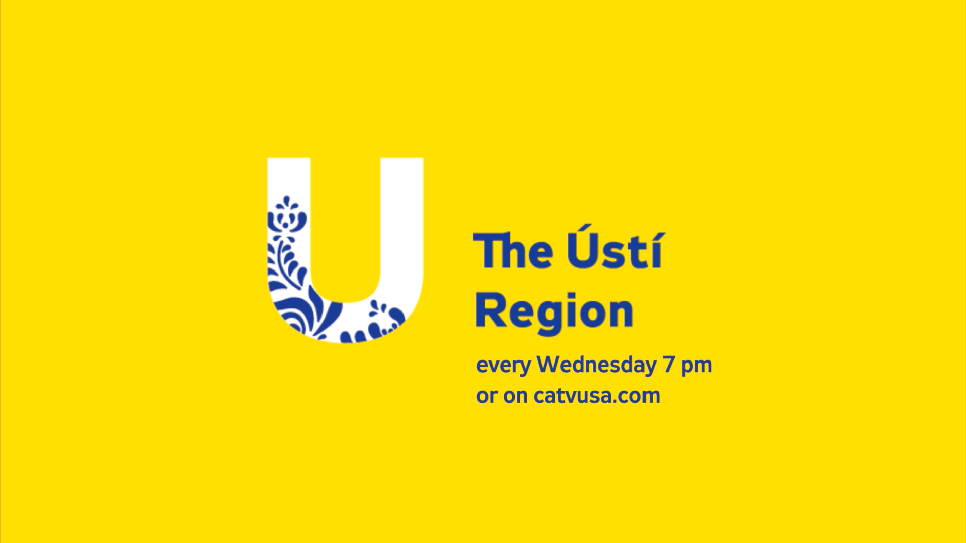
For the scripts of the jingles and TV spots for the individual shows we worked with properties and movements typical for a cat. The unifying element of the TV jingles is a ball of yarn, that the cat is playing with and runs after. The cat is therefore – in a symbolic way – running through the regions, where a folklore ornamental motive is implied in the first letters. This motive symbolically unifies all the regions of the Czech Republic. The tumbling ball of yarn thus brings the cat towards the mark of an individual region. The three TV spots work as a shorter version of the advertisement for the show – again, the cat behaves characteristically, it brushes against the TV screen, licks it, or waves its tail. At the end of these spots the region mark appears, accompanied by the broadcasting time. We also created jingles for three other separate shows: cooking, traditions and Czech lessons. Here we switched the ball of yarn for other typical motives. For the cooking show we chose a pot, the traditions show is represented by a “pomlázka” (a typical prop made from young willow branches), and the lessons which are represented by a classroom chalkboard.
The colours that we’ve applied for the background are complementary colours for the primary red and blue of the whole identity – yellow and turquoise green. We’ve decided to use yellow to emphaisise and separate the region spots from the other shows. The yellow background is combined with dark yellow folklore motives, blue typeface and the mark of a region, which is made out of the capitals of the first letters of an individual region, to which a subtle ornament is also added. The combination of yellow and blue also appears in other spots. In the cooking, lessons and traditions jingles, a turquoise green appears instead of the yellow, in addition with a black typeface.
The Website
The better part of the whole process of designing the web was mostly in the research of the original website. It wasn’t easy to familiarise oneself with the structure of the content, so we’ve decided to invent a whole new way of structuring the information. In this process we’ve tried to concentrate on a comfortable user experience, that would give the viewer precise and clear information, although for us, a collaboration with a UX specialist and copywriter would have been ideal.
The main compartments of the menu are the sections WATCH and READ, which separate precisely the text and video from each other, this wasn’t very obvious at the beginning. The web buttons also play an important part in the design, they link the individual segments together, but also lead the viewer to the EXPLORE page, which sums up all of the text and video content in a neat map. We’ve also tried to give more attention to the DONATE component, which is absolutely crucial for a non-profit organisation. Of course, the main page is also very important and does a big first impression on the viewer. Naturally, a mobile application was also devised. Finally, we have conceived the most important parts (as well as the smaller neglected parts) of the website in the Adobe Muse software, which gives us a better notion of how the whole philosophy of the website works.