

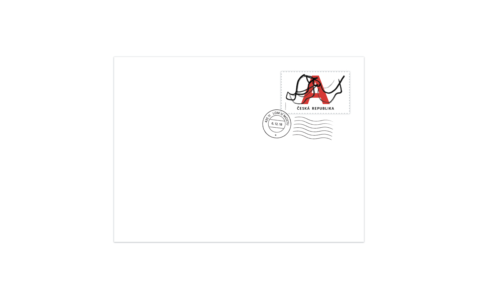


My classical stamp is based on drawings of the maples tree fruit. I started to draw these drawings with an artistic coal, later I used an indian ink and the final – used drawings are drawn by a fix. Basically it’s a quick sketch placed to create a stamp. The drawing is accompanied by a typography to which the letter A dominates. It also symbolizes the value of the stamp. For the letter I used the Lato font and for the text font called Hind. I used red to go with it because it’s one of three colors of our national flag. I think it makes my stamps more alive and underlines the dynamics of the fruit.
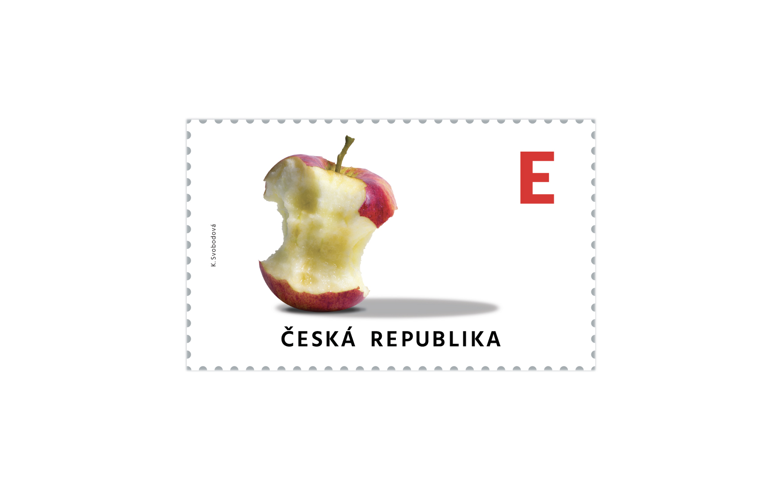
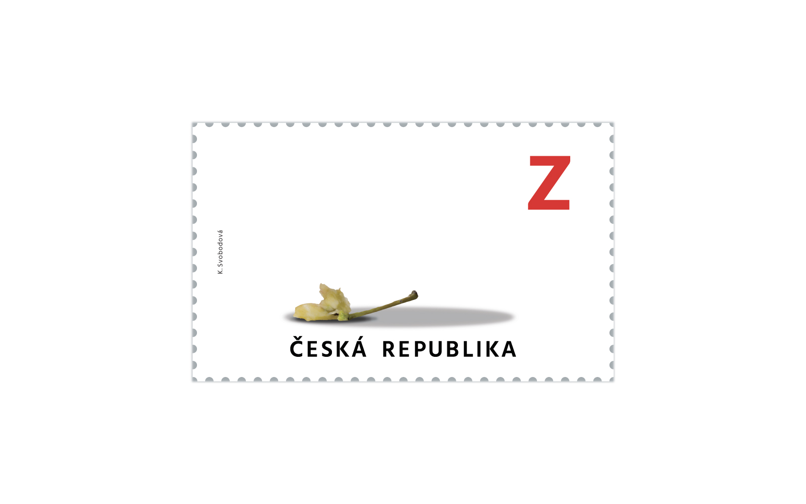
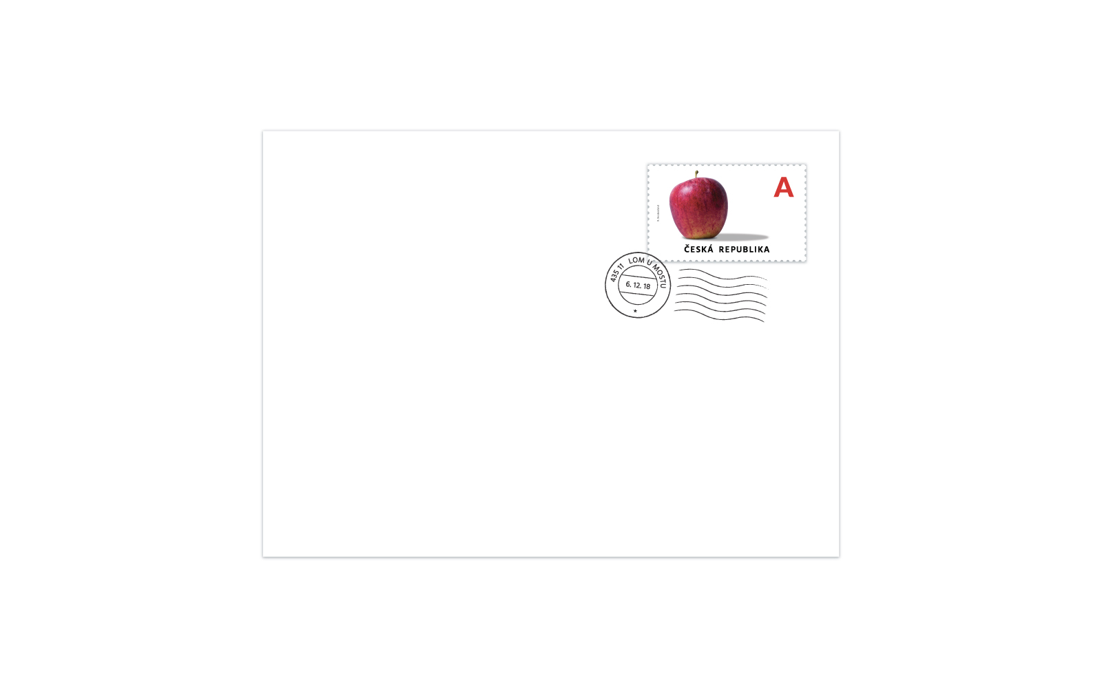
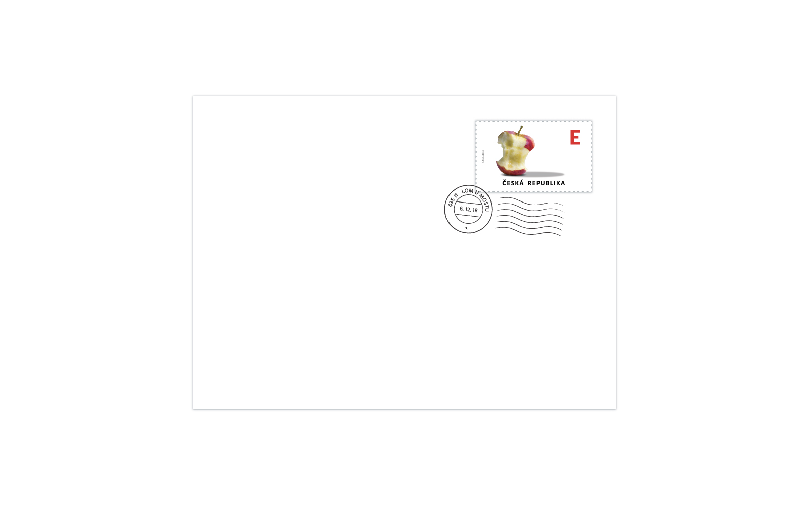
The main idea of my conceptual stamps is wandering of an apple. The fruit of an apple tree which is the most typical fruit in our country the same way as it‘s in the whole middle Europe. The concept is about the apples export from our republic. Export or traveling with the apple. So in our country the apple is full meanwhile in Europe – there’s only half of it. When the stamp arrives abroad there’s almost nothing left. Hidden meaning is also in the shadow. The original shadow from the first apple stays even when there’s almost nothing left. Did it’s true, delicious taste stay in the Czech Republic? Or you’re only so full of it that you see it even after you ate it all? That’s only up to you and your imagination.
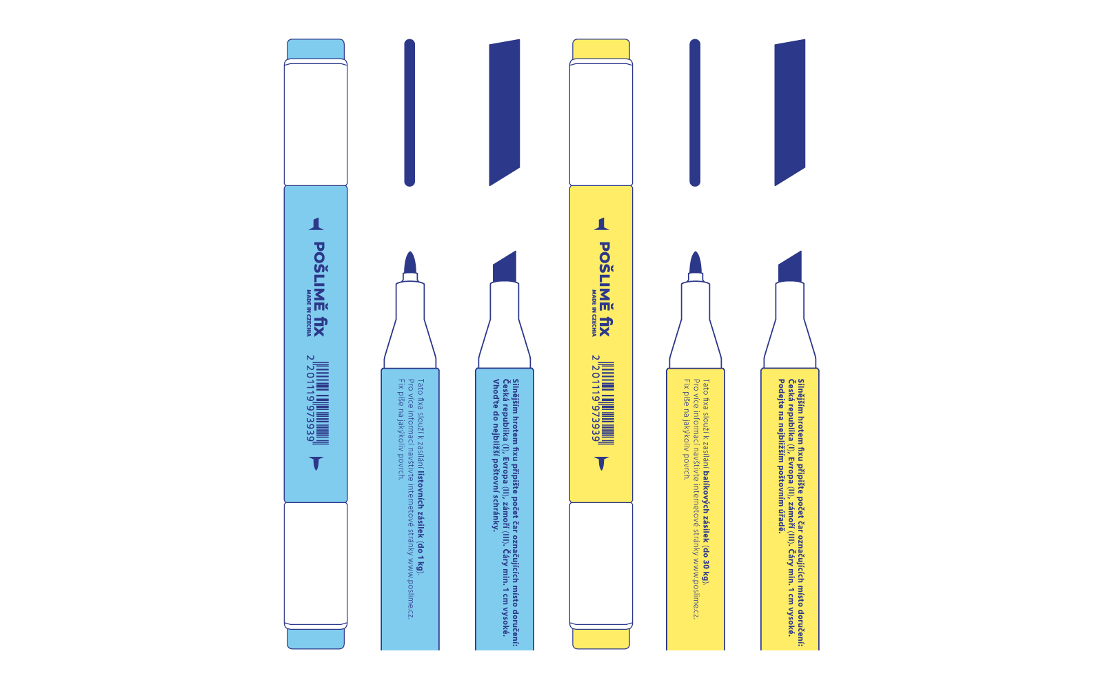
The last task was to create an experimental stamp – stamp from the future. In my opinion there will be no classical paper stamps in the future. We won’t be designing them anymore because it’s gonna be too difficult for us. And that’s why I created a new, modern version of a stamp. It is a fix with a special ink. The fix’s got two points. One of them has the special ink in it, with that you draw lines on the thing you want to sent – one line for the Czech republic, two for Europe and three when you’re sending abroad. With the second point you write the address. The fix writes to any surface so you can sent almost everything you want. It also has many variants. The most common ones are “fix for sending letter shipments (max 1 kg)” and “fix for sending parcels (max 30 kgs)”. I designed the packaging and applied it to a fix already purchased. I used colors of the Česká pošta company – blue and yellow. Font used in the logo is called Montserrat and the text is typed in Hind.